
Monday, November 4, 2013
So long!
Thanks for all the support on my blog, I truly appreciate every comment. However, in the interests of trying to post more, work more, and simplify my life, I'll be making any new posts about my work on my tumblr. I hope you'll join me there! http://kalidraws.tumblr.com/
Tuesday, August 20, 2013
Omoide Yokocho


Omoide Yokocho (otherwise known as "Memory Lane" or "Piss Alley") for Light Grey Art Lab's In Place show. Buy a print here!
Omoide Yokocho is a series of slim, cramped alleyways in Shinjuku, packed with yakitori stalls that can only fit 5-10 people at a time and salarymen looking for a drink after work. It's basically a timecapsule from post-war 1950's Japan, and it looks like an amazing place to visit. A lotta work & reference, but one of my favorite pieces I've done. Take a quick walk through via youtube, here! And thanks to Irene Koh for double-checking all my japanese signage!
Can you spot the cat? :3
Thursday, July 25, 2013
7 Deadly Sins
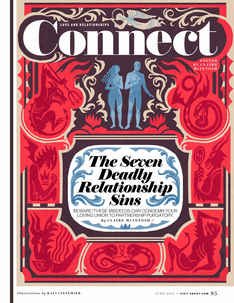


These pieces are from the June issue of Ebony, about the 7 deadly sins in relationships. Thanks to my awesome AD Lynn Galloway, who saw my Mothers Superior illustrations and requested illos that incorporated text similarly. I had a fantastic time working on these modern-y illuminated manuscripts!
I thought of “Adam & Eve being tempted" as a general theme, but was asked to tiptoe around any direct religious connotation. It was a good challenge to try and figure out decorative shapes & images that hearken to ye olde manuscripts, but also ‘feel’ right for the mood of the sins. (Also, have you looked up medieval demons? These dudes are the dooooofiest!)
If anyone needs any more illuminated manuscripts, lemme at ‘em!
Thursday, June 20, 2013
SPACE! The Gallery Show!

My piece for Mike Mitchell's SPACE! The Gallery Show, opening this friday at Gallery 1988 in LA! (with a ton of other amazing artists, oh man!)

I'm a lifelong sci-fi fan, and when I was deciding what to contribute to the SPACE! show I thought of my more memorable sci-fi experiences. Watching Silent Running with my dad as a kid both fascinated and terrified me, and I've been interested in how nature fits into a space travel ever since. What are the logistics of putting something so beautiful and complicated into a very fragile & isolated location?
In the 1970's, NASA, with the help of Dr. Gerard K. O'Neill, studied a variety of plans for space colony designs. I think it's notable that there was a lot of awesome original art created for these plans to inspire people and generate interest in space travel. It's amazing that these same designs have also informed so many modern day depictions of space stations in books, tv and movies!
In the spirit of those NASA illustrations (and after doing a silly amount of additional research) I made a travel poster for a new ecological space habitat of my own design!
Shoutout to Sam for inspiring me to use Google Sketchup....I've been watching him use it very effectively to make simple environment/perspective reference and decided to take the plunge myself. No way in hell I'd be patient enough to draw an inverted curved perspective otherwise!
Some of my preliminary process steps:


Tuesday, June 11, 2013
Summer Vacations...
...aren't always the most relaxing. I was asked to illustrate an essay in Boston Globe magazine written by an author who prefers to just stay HOME during the summer and let everyone else clog up the roads and sweat out in the heat.
My AD suggested an uncomfortable roadtrip, and I thought that adding a glimpse of the cool and relaxing house she's leaving behind would be a nice contrast. (as a homebody at heart, I sympathize)

I myself will be moving apartments not once but TWICE this summer--in two different states no less--so I'm getting geared up for my own "uncomfortable roadtrip" haha. But! I'll be living it up in Brooklyn at the end of it, so here's to some future summer fun!
Thanks again to my AD Ryan Huddle!
Tuesday, May 14, 2013
Editorial Grab-bag!
In between a few longer-term projects I've worked on recently, I've had a bundle of editorial pieces from various times this year that I've been slow in sharing. So here they are now!!!
Family Circle-- An illustration for a personal essay about a teachable moment that happened in a grocery store check-out lane.
Boston Globe-- For a personal essay about beer snobbery--craft beer enthusiasts are often labeled as snobs, but the people who exclusively drink Coors or Bud Light are just another kind of snob too!
The New York Times--A quick illustration for the Preoccupation column. The article was about the clash between older management and young college grads--the younger generation is having a hard time finding employment because many CEOs are skeptical of their workplace value.
Thanks to my ADs Amanda Kirk, Ryan Huddle, and Minh Uong!
Family Circle-- An illustration for a personal essay about a teachable moment that happened in a grocery store check-out lane.
 |
| Sketches |
 |
| Final |
Boston Globe-- For a personal essay about beer snobbery--craft beer enthusiasts are often labeled as snobs, but the people who exclusively drink Coors or Bud Light are just another kind of snob too!
 |
| Sketches |
 |
| Final |
The New York Times--A quick illustration for the Preoccupation column. The article was about the clash between older management and young college grads--the younger generation is having a hard time finding employment because many CEOs are skeptical of their workplace value.
 |
| Sketches |
 |
| Final |
Thanks to my ADs Amanda Kirk, Ryan Huddle, and Minh Uong!
Thursday, April 11, 2013
Ivy League Confidential
Here's a quickie illustration for today's New York Times Letters section! (it's less than 2.5 in tall in print! Eee, so cute) You can find the letters & my piece online as well!

The letters are all in response to the Op-Ed article "The Secrets of Princeton", which argues that the social connections that happen in elite universities are far more important to the graduates' success and privileged standing than is generally acknowledged. "It's not what you know, but who you know"
My ivy-centric sketches:
 Thanks to my AD Alexandra Zsigmond for the chance to draw some secrets!!
The letters are all in response to the Op-Ed article "The Secrets of Princeton", which argues that the social connections that happen in elite universities are far more important to the graduates' success and privileged standing than is generally acknowledged. "It's not what you know, but who you know"
My ivy-centric sketches:
Thursday, March 28, 2013
Domestic Etch-- and new prints!

I wanted to post my cover illo/design for an upcoming issue of Domestic Etch magazine! The theme was “The Past”, and of course I wanted to draw a medieval alternate reality! It was a while back, but I’m very happy to report that my cover was featured in the Society of Illustrators editorial show this year (along with this piece, and this one!) Thanks to my AD, Elizabeth Godspeed!
Also, I updated my print store with a bunch of new pieces, including my Domestic Etch cover (minus the type), the rest of the images you see below, and more! Inprnt has seriously amazing print quality—the colors SUPER ACCURATE—so check ‘em out if you need to fill some wall space with lady space marines or floating donuts!


Monday, March 25, 2013
The Lost Property Office
Mitzi, an American girl attending international school in Tokyo, discovers the mysterious Lost Property Office while searching for her friend Maki's homework in the sprawling Tokyo subway system. Mitzi gets her own chance to become a Finder like Mr. Motomeru and his nephew Yuki, and she soon learns that there's more to Finding than traveling through space-time!


This is a two-part young adult short story by Marji Napper in the March and April issues of Cricket magazine. It was a lot of fun to illustrate and research (Tokyo subway tunnels! Japanese houses! Tokyo Station in the 1930's!) and I'm pleased with the results. I worked on both chunks of illustrations at different times, but I tried to keep the feel and colors relatively tied-together.
Thanks to my AD Karen Kohn--I met Karen way back when I was still in college and I interned at Carus Publishing for a summer. I subscribed to Cricket magazine when I was a kid, so it was wonderful to get a chance to contribute!
Looking at the images all together, what I remember most are the things I was listening to while I worked on these illustrations. For the last 3, I specifically remember listening to the Feast for Crows/Dance With Dragons audiobook mashup, Victo Ngai's interview on Your Dreams My Nightmares, and Stella live in Boston. This seems to happen with most of my illustrations....the strongest memories are what I was watching or listening to while drawing them. Go figure, brains!
Monday, March 18, 2013
Lady Knights//Women Warriors

My contribution to the Lady Knights//Women Warriors zine! I'm psyched to be in it with all the other awesome contributors, every piece i've seen for it looks RAD. Thanks to Abby, Julia, and Roxie for putting it all together--they'll be selling at MoCCA!
I've always had a thing for mysterious heroes, and I recently started a love affair with motorcycle ladies. (this one is a bosozoku bike!)
When I was asked to be in the zine, I was already considering making a book of my own warrior women...I'm even more excited now, so we'll see!
Wednesday, February 20, 2013
Anne Fontaine Holiday Postcard!
Before spring swings into full bloom, I wanted to share another postcard I created for french fashion designer Anne Fontaine! I had a great time working with them on a Bastille Day postcard and was happy to try my hand at it again for a holiday-season themed mailer!

I was provided with photos of one of their new winter coats & bags, gloves, belt, a neck ruff, and a pair of cute booties. They wanted a Karlie Kloss sort of look for the model, and the backdrop this time was to be another iconic french location like the Arc de Triomphe or the Pont Alexandre III bridge!

For my sketches, I actually spent a pretty long time looking for reference images of these locations that weren't your typical straight-on tourist views--I wanted to show a little more depth of space. (in the process I ended up looking through a lot of flickr accounts and french blogs!)
The Arc de Triomphe background was chosen, and we ended up changing the pose and the hair a bit. (it became sort of an inverse-pose of the previous Bastille Day postcard!)

Thanks again to my contact Christina Ramirez-Madisson and Anne Fontaine for the lovely job!
Thursday, February 7, 2013
The Secret of 50 Berkeley Square!

A fun one for MentalFloss magazine's Jan/Feb issue! No nuns this time, but there IS a haunted house! 50 Berkeley square is a townhouse believed to be haunted as far back as the mid 1800's--the reclusive owner at the time let the place fall apart, and there are tales of ghosts there that have actually frightened visitors to death!
The article is about whether the mysterious owner, Mr. Myers, was actually the inspiration for Dickens' Miss Havisham from Great Expectations. My AD wanted an image of a modern person exploring a decayed & spooky Georgian style townhouse, preferably with some nice blue/yellow colors. I thought it'd be nice to use a flashlight as the image's light source, and an interesting graphic element.
 |
| Sketches |

Thanks again to my AD Winslow Taft for the fun & spooky assignment!
Wednesday, January 30, 2013
Searching for Secrets
As part of my MAKE 2013 workshop, I led a project with all my participants for Light Grey Art Lab's Message in a Bottle show. It's a little show within a show--ours is called Searching For Secrets, and each person created a piece with a letter hidden inside. The pieces are arranged in order, so once you find the letter in each image, they spell out a message together! I couldn't be happier with all my participants' work, it's a great range of styles and subjects with plenty of mystery to go around (and letters hidden in different ways!) Take a look and figure out the message for yourself!
The theme I gave everyone was Searching for (or discovering!) a secret.
Here's mine, 'Relic'
Part of the project was challenging everyone to use informal subdivision to help come up with sketches. I felt that the working method itself is appropriately secrets-themed--you're looking at a bunch of lines and trying to figure out an image hidden within them.
Here's my informal subdivision lines and the sketch I settled on:

I actually had a million other sketches, but lost the file with all of them in it. D'oh!
I thought that something sci-fi themed would be fun to draw--I've been reading a lot of cyberpunk recently (Snowcrash, The Diamond Age, Neuromancer) and visions of dirty dystopian futures have been floating around in my mind.

I ended up moving the whole image down a bit for better compositional value, which means my final image doesn't line up with my informal subdivision quite as well. However, I think the main value of informal subdivision is to suggest composition and generate ideas. If you decide to work with informal subdivision and think that something doesn't look right, change it!
Thanks again to all my participants for their fantastic work! You guys did great.
The theme I gave everyone was Searching for (or discovering!) a secret.
Here's mine, 'Relic'
 |
| Can you find my letter?? |
Part of the project was challenging everyone to use informal subdivision to help come up with sketches. I felt that the working method itself is appropriately secrets-themed--you're looking at a bunch of lines and trying to figure out an image hidden within them.
Here's my informal subdivision lines and the sketch I settled on:
I actually had a million other sketches, but lost the file with all of them in it. D'oh!
I thought that something sci-fi themed would be fun to draw--I've been reading a lot of cyberpunk recently (Snowcrash, The Diamond Age, Neuromancer) and visions of dirty dystopian futures have been floating around in my mind.
I ended up moving the whole image down a bit for better compositional value, which means my final image doesn't line up with my informal subdivision quite as well. However, I think the main value of informal subdivision is to suggest composition and generate ideas. If you decide to work with informal subdivision and think that something doesn't look right, change it!
Thanks again to all my participants for their fantastic work! You guys did great.
Tuesday, January 22, 2013
MAKE 2013 Workshop Thoughts
 |
| Starting things off! |
First off: Whoa! What an amazing experience! Its already been 2 weeks since my MAKE 2013 illustration workshop that I led at Light Grey Art Lab, but I still get the warm-and-fuzzies when I think of all my awesome participants and and the LGAL crew!
For a blow-by-blow breakdown of everything we did that weekend, be sure to read Light Grey Art Lab's lovely writeup of the workshop! You can also take a look at alllll the photos from the weekend here! (which is where I got almost all my photos for this post. Thanks Chris!)


Freelance illustration can often be an isolating pursuit, so it was a real treat to be reminded of all the fun that happens when you get a group of artists talking and sharing together in one room. All of my participants came from different walks of life and various career paths--students, designers, animators, freelancers, company artists--and it was really eye-opening for me to hear about all of their goals and experiences. As a bonus--the chilly temperature in MN has made my Baltimore winter feel positively breezy in comparison. ;)
Our talented panel guests Brad Mcginty, Alyssa Thomas & Allegra Lockstadt were also very generous and informative about their own practices! Good insights all around and great to meet them all!


 |
| From the left: Brad, Allegra, me & Alyssa! |
Overall, I wanted to write up a few key things that I took away from the workshop:
1. Holy cow, everyone is awesome!!
2. Everyone has a different goal and a different timeline. And that's as it should be! It's easy to sabotage yourself by comparing your path to others (I've definitely been guilty this) but racing against other people isn't healthy, and it's not helpful. There is no One True Road To Success, everyone has different needs and different steps. At the workshop we all analyzed what we really wanted out of life and work and then came up with a doable step-by-step plan for how to achieve our 2013 goals. It was a great exercise, and made me realize that some of things I thought I wanted weren't actually the important goals for me. It's all too easy to set lofty ideals for your work and then become disappointed when you don't reach them. Breaking an overall goal (like working on jobs in a certain field or balancing work/life) into tiny monthly chunks is much more palatable and easy to fulfill. My own biggest goal is to try and separate, equalize, and maximize my social time and my working time!
3. Artists LOVE to make things hard on themselves. I think everyone does this in one way or another--agonizing over the tiniest details, feeling guilty about doing or not doing a particular thing, for being at a particular place in life, for working too hard or not working hard enough. It's easy to feel like you're alone in this situation, but everyone feels unsuccessful sometimes, and sometimes quite often. I certainly do! And actually hearing all the same insecurities from other people at the workshop made me realize that this is a massive delusion--if we all feel like we're insufficient in ways other people aren't, it can't be true. So why torture yourself needlessly? Self-criticism & self-doubt is definitely healthy and needed, but it was a good reminder that giving yourself some love and forgiveness should be just as important. Feel pride in what you have accomplished as a creative person and don't give up!
4. Share! In my experience, when you are generous with other people, they are more likely to be generous with you. It sounds so cliché, but you can learn a lot from others by giving away your own resources. You can also learn a lot about yourself! Most of my illustration decisions/processes were internalized or just intuition when I graduated school. However, in the process of teaching/blogging/workshopping, I started to analyze the differerent aspects of image creation, how I do it, and how I'd present it to other people. That got me thinking about the decisions I make, why I make them, and how other people approach the same things. Working consciously and sharing with others has been so helpful to me in generating new insights about myself and illustration in general.
 |
| You guys are the best! |
This was my first workshop and I REALLY HOPE it isn't my last! My time in Minneapolis was the perfect experience I needed to get reinvigorated for the new year, and I can't wait to see where my participants go from here! Big thanks to everyone who came to the workshop--I can't believe we had people from all across the US (and Canada!) and every single person was so friendly, generous, and talented.
 |
| From the left, thanks to Lindsay, Chris, Jenny, Jared & Francesca! And if you THINK that I added Jenny to this image through the magic of photoshop...you are clearly mistaken. |
Lastly, as part of the workshop, I gave everyone (including myself) a group art project! I'll be putting up my piece a bit later this week and hopefully linking to all my participants' work as well! Everyone's awesome work will be seen in a special section of the Message In A Bottle show at Light Grey Art Lab, opening this friday, so check it out!

Subscribe to:
Posts (Atom)